How Data Visualization Helps Us to Approach the COVID-19 Pandemic

With new updates developing by the hour amidst the evolving COVID-19 pandemic, trying to grapple at the most relevant information can be overwhelming. Data visualization has helped to synthesize this complex phenomena and shape the timeline of the Coronavirus pandemic that has drastically changed how we go about our daily lives. While commonly used to communicate data to the general population, visualization is now having quite a real-world impact in the face of this crisis.
Having access to diverse sets of visualizations allows the public to obtain information relevant to their situation, whether they are a community member or a political leader. “In general we react more strongly to data that feels close to us,” said Catherine Plaisant, Senior Research Scientist at the University of Maryland Institute for Advanced Computer Studies. “[The American public] may dismiss stories of China and Italy, and only react when shown data about their own hospitals being overwhelmed.”
In particular, data visualization charts have been central in illustrating the concept of “flattening the curve” so that the public can better understand the need to practice social distancing so that the spread of the virus is slowed.
Maps have also been shown to resonate as a visual representation of data, because people like to see where things are happening. However, maps don’t always convey the entire story. “Namely, it’s difficult for a map to convey both time and magnitude, both of which are crucial for understanding a pandemic,” said Brian Ondov, researcher and Ph.D. student at UMD’s Department of Computer Science. Additionally, “when you see an area on a map where the confirmed case number is low, you don’t really know if that is because there aren’t many cases or just not much testing.”
Researchers and faculty at the University of Maryland Human-Computer Interaction Lab (HCIL) began compiling a central collection of data visualization charts, videos, and other resources covering COVID-19. Below are four of the most impactful data visualizations gathered by the HCIL team that have aided in illustrating the emerging COVID-19 cases and where the cases are located, the reasons behind why the virus spread its way across the world in a matter of days, and projections based on the current situation.
- The New York Times: How The Virus Got Out
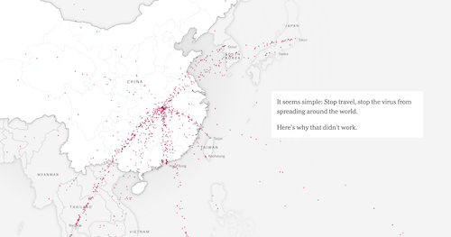 The New York Times published an interactive timeline showing how the Coronavirus initially took root in Wuhan, China. As users scroll down the page the timeline reveals the NYT’s analysis of hundreds of millions of travelers and shows why extensive restrictions put in place to stop an outbreak haven’t been enough to stop it.
 - information is beautiful: COVID-19 Infographics
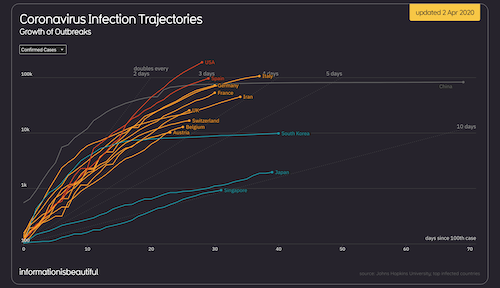
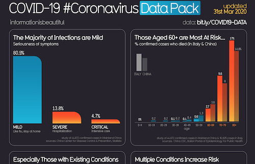 The site information is beautiful provides daily updates on current data related to COVID-19 in the form of a series of infographics, including current case numbers by country, who is most at risk, deaths per million people, etc.
 - The Washington Post: Why outbreaks like coronavirus spread exponentially, and how to “flatten the curve”
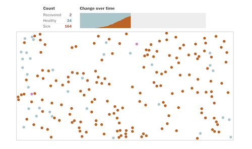 The Washington Post posted an article with several infographics showing the effects of social distancing through a simplified simulation. The simulations are randomized depending on if you restart a simulation or revisit the article, so the results will change.However, even with different results, moderate social distancing is proven to more often than not outperform the attempted quarantine, and extensive social distancing usually works best of all. Below is a comparison of your results.
 - COVID-19 Projections
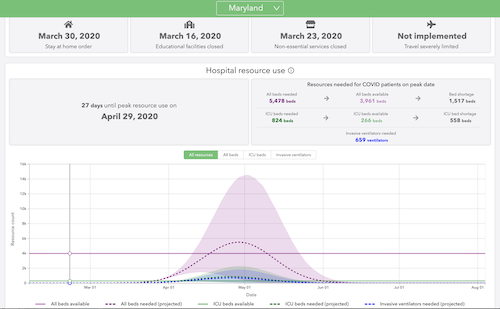 The charts published by the Institute for Health Metrics and Evaluation (IHME) show projected hospital resource usage by state based on the current COVID-19 deaths. The charts also display social distancing measures adopted by each state. The models assume continued social distancing until the end of May 2020. In states without social distancing measures currently in place, it’s assumed they will be in place within seven days of the last model update. If not, the number of deaths and burden on their hospital systems will likely be higher than the model predicts.
The HCIL will be hosting a virtual hackathon from April 4-5 inviting people from all backgrounds to develop solutions for some of the most critical impacts of COVID-19. More information is at https://hcil-covid19-hackathon.github.io. To see a longer list of visualizations on the COVID-19 pandemic, visit the HCIL’s site here.